Loading... Please wait...


WHY POLYESTER?

As new markets highlighting engineered materials continue to emerge, and new inorganic materials enter the market, there is an increasing desire for more saturated colors; colors beyond those formulated for natural fibers; colors whose appearance displays greater hue intensity. Our new Pantone Polyester Standards address this need and demand for a deeper level of coloration.
Developed with dyes specifically for polyester, these 203 colors are of a distinct difference from our cotton formats; displaying a color depth best achieved with a non-cotton-based textile dyed system. There are many colors in our new polyester collection that could not reproduce on cotton with the same degree of clarity or intensity.
Creating a special collection of colors using dyes specifically for polyester removes the guesswork, allowing you to reproduce these colors quickly and effortlessly in polyester, as well as other synthetic fibers.
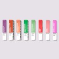
All 203 PANTONE Polyester color references are arranged by color family in a single-volume binder. Each 5 x 5 cm double-layered, unbacked mini-swatch is removable making palette development easy.
Each PANTONE Polyester color reference is also available in individual 10 x 10 cm Swatch Cards and can be supported by Global QTX spectral data.


Have the swatch cards and need the digital QTX data for your design files?
CURATING THE COLOR SELECTION
As with all of our Pantone Fashion, Home + Interiors color palettes, our new Polyester collection was curated to include the most relevant shades; from timeless neutrals to eye-popping neons. To provide designers with the most sought-after shades, we focused on areas of significant market importance and color trend movement. The consideration of how multiple industries view the colors was key, and balance was a primary factor when making our color selection. With increased market crossover in material substrates and color stories, it was essential that the color assortment in our new polyester system be a comprehensive mix of colors that would be relevant across all design industries including fashion and all fashion and lifestyle driven markets, as well as home furnishings.
We continue to be committed to our clients, introducing palettes that are relevant, trend forward, and meeting the color needs of our users. Pantone Fashion, Home + Interiors: the right colors on the right materials. BE ON COLOR.
Explore a variety of options for color expression with trend palettes inspired by our PANTONEVIEW Colour Planner seasonal trend forecasts:
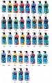
MODERN WANDERLUST
Cool Jaded teal and pale wheat Pancake Batter come together to cool off a palette of hot sizzling brights including an Exuberant Orange, buoyant blue Spring Break, lush green Irish Jig and theatrical Berry Pinwheel.

Color Harmonies

Palette inspired by PANTONEVIEW Colour Planner Autumn/Winter 2020/2021 Nest.

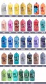
FRESH LIFE
Channeling environmental concerns, a grouping of colors emblematic of a fresh and cool land and waterscape display a naturally effervescent feeling. A sharp Lime Zest, fresh Powdered Sugar and Candied Yam inject a bright and distinctive contrast.

Color Harmonies

Palette inspired by PANTONEVIEW Colour Planner Spring/Summer 2020 The Sea.


ABOUT THE NEW COLORS

- Ideally suited for synthetic materials, our 100% polyester color standards serve as complements to Pantone Textile Cotton System (TCX) and Pantone Textile Nylon System (TN) color standards
- Uniquely curated colors across all color families meet the market demand for athleisure, footwear, swimwear, sleepwear, fashion accessories, and home furnishings markets
- Swatch Cards feature unbacked, double-layered fabric for ideal color visualization and measurement

- All colors are backed by Spectral Data for fast, easy, and accurate production matches
- Pantone’s material selection, global availability, and speed-to-market keep you one step ahead of the competition